Digital Growth
Conversion Rate Basics 2026: 9 Fixes That Pay for Themselves
Conversion work is mostly subtraction: fewer fields, clearer offers and a page that loads before the visitor gives up. We list nine fixes in 2026, ordered by how often they are the real problem.

Conversion rate work attracts grand redesigns. In practice the biggest gains usually come from removing friction a visitor can feel: a slow page, a confusing offer, a form that asks for too much. Fix those before you hire a designer.
Define the conversion first
A conversion is one specific action that matters: a purchase, a booked call, a completed sign-up. If the page tries to count every click as a win, the numbers stop meaning anything. Pick one primary action and make everything else secondary.
Write it down in a sentence. "The visitor should book a 20-minute call" is a target. "The visitor should engage" is not. The sentence decides what you remove and what you keep.
If a visitor cannot say what happens after they click, the page has already lost.
Fixes one to three: speed, clarity and one offer
Speed comes first because it affects every other fix. A page that takes five seconds to become usable loses people before they read the headline. Compress images, remove unused scripts and test on a mid-range phone. Our website speed guide has the details.
Then make the offer obvious in the first screen: what it is, who it is for, what it costs and what happens next. One offer per page. A page that sells a newsletter, a consultation and a course at the same time converts none of them well.
Fixes four to six: forms, trust and pricing
Remove every form field you do not use in the first week. Each additional field costs completions. Ask for the email, get the conversation started, and collect the rest later. If you need a phone number, explain why.
Add the trust signals a stranger needs: a real name, a photo, a clear refund or cancellation policy and proof that other people have done this before. Be specific. "Trusted by thousands" is weaker than a named example with a result.
Fixes seven and eight: mobile and friction
Most traffic is mobile, so design for the thumb. Make buttons large, keep the main action visible without scrolling and remove any hover-only interaction. Test the path from ad to confirmation on a real phone, not a simulator.
Walk the path yourself and note every moment of doubt. A missing delivery estimate, an unexpected fee or a required account creation are all friction. Every one you remove is a small conversion win that compounds.
Fix nine: test and measure
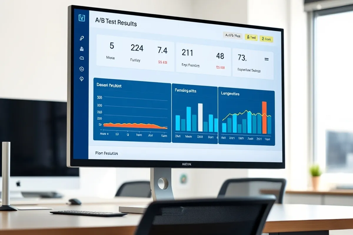
Test one change at a time against a control. Write the baseline first, run long enough to see a pattern and separate the result from the season. A change that lifts conversion in a sale week may do nothing in a normal one.
Finally, align the email and the ad with the page. The promise that brought the visitor should appear in the first sentence they read. Our email marketing guide covers the other half of that handoff. For neutral background on testing methods, the Wikipedia article on A/B testing is a fair primer.